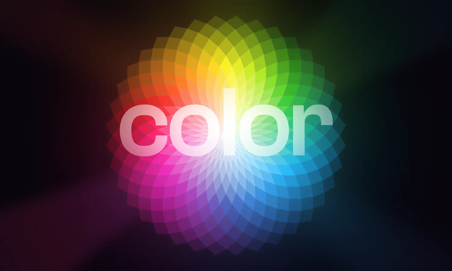
Probably the first association that comes to us when we think about design is something related to colors. Our eyes can distinguish between many shades, and each of them is special in its way. Some may not even realize that each color may hide a feature of human psychology, which can tell you much more about a person based on favorite colors.
There is even such a thing as color psychology. It is popular in the marketing sphere. But it is more than just knowing your customer’s favorite color or using stereotypical associations in branding. It is necessary to use colors for effective brand sales and subtle persuasion of the client by influencing his purchase decision.
90% of our instant product decisions are based only on color, so we should compare the brand’s characteristics with the corresponding color. Besides having a variety of meanings and associations (sometimes contradictory), people also react to them based on their own subjective experiences.
Knowledge of such facts can also be valuable for a graphic designer. After all, choosing the right color for a designer is one of the basics. Graphic design occupies a special place in sales. Promotional products, packaging, websites, logos, and boards are all common in marketing. All this exists with the help of graphic design.
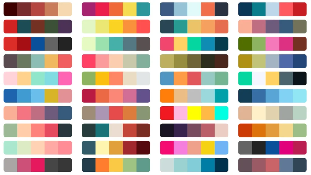
Let’s look at examples of primary colors and their usability in different brandings:
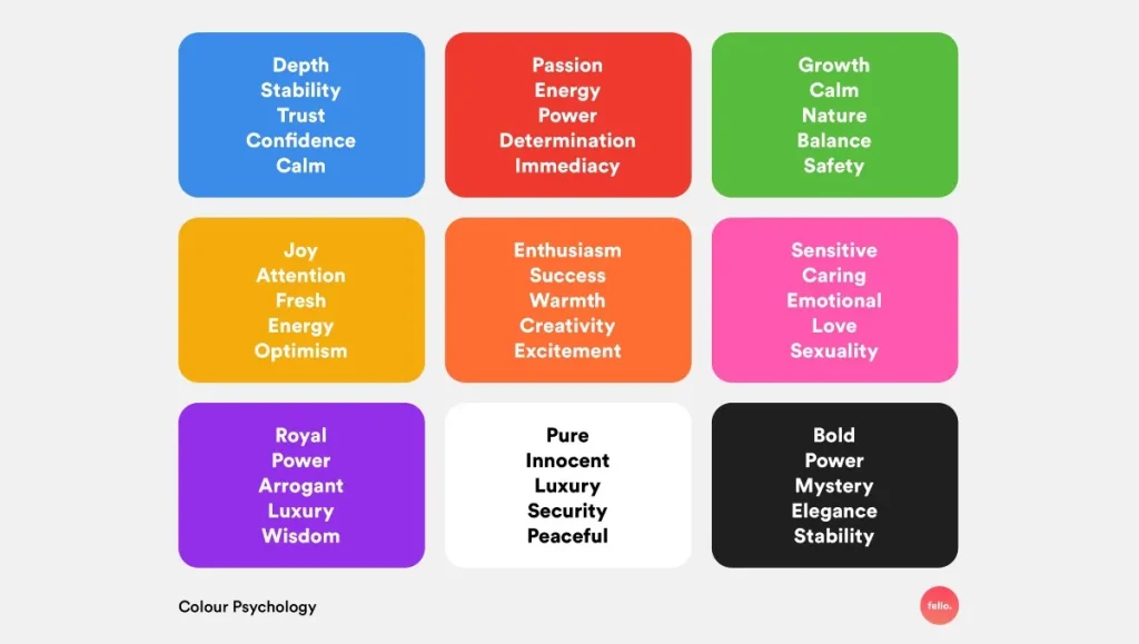
1) Red: There is an opinion that the red color in the design quickens the heartbeat and creates the impression of “necessity here and now”. Therefore, you can often see red during sales, promotions and industries such as machinery, food and transport.
2) Blue: For consumers, this color is associated with safety, tranquillity and inspires confidence. A distinctive feature is that even people that suffer from color blindness can see it. The blue color is used in their activities by such companies: as healthcare (dentistry), banking services, aircraft construction, and agriculture.
3) Green: The color of nature, growth, harmony and environmental friendliness. It is associated with tranquillity and relaxation. Companies use such a color scheme in design related to energy, technology, household, food, finance and healthcare.
4) Orange: Associated as bold, ambitious, confident and youthful. It carries a call to “buy”, “subscribe”, “or register”. This color aimes impulsive buyers during promotional offers. Designers use orange in healthcare and the sale of equipment.
5) White: Evokes associations of wisdom, purity and health. Also, the white color doesn’t carry any aggression. It applies to medicine and innovation.
When creating any element of branding and advertising materials, it is crucial to remember how color affects the consumer. Of course, that’s not just about color. Everything is significant in the complex. Competent placement of elements, style, shape, font of writing and correctly chosen words combined with talent and skills — that’s part of successful graphic design. It is necessary to know not only color’s values but also the audience, age, gender, interests and lifestyle associated with colors.
Psss, more exciting topics are coming soon on this platform. Stay tuned!