A well-designed logo can communicate a brand’s personality, values, and mission in a simple yet powerful way. However, it requires more than just a creative spark. Many common mistakes can detract from a logotype’s effectiveness and hinder a brand’s growth. In this article, we’ll discuss the most usual logo design mistakes and how to avoid or fix them. So, let’s overview the regular pitfalls and learn some practical solutions.
Overcomplicated Design
A cluttered logo can have the opposite effect of what you intended, making it difficult for viewers to understand or remember your brand. A simple logotype is more functional for communicating your brand’s identity and message. However, it doesn’t have to be boring or uncreative.
Instead, you should aim for a clean design that is easy to read and recognize. By doing so, the logo will be more effective and not overweighted.
Use of Generic Icons
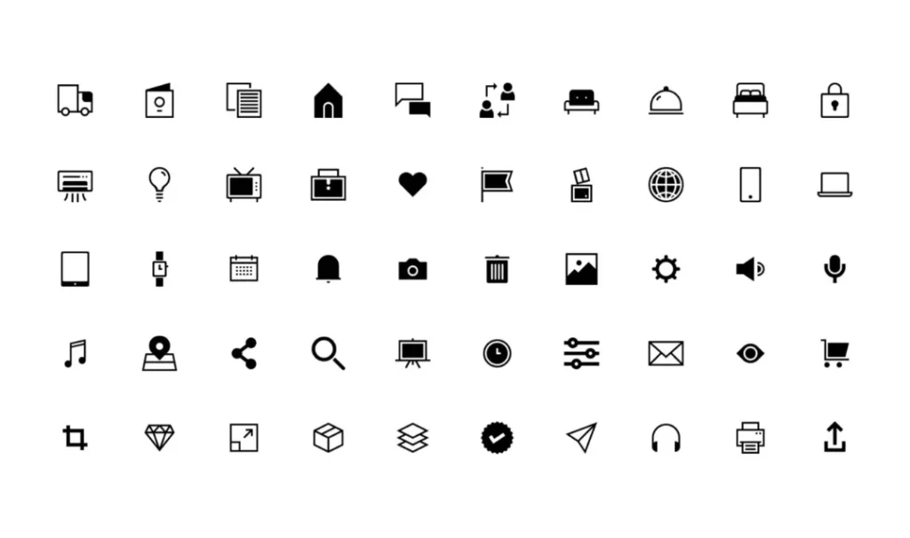
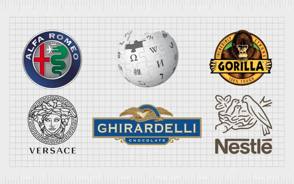
Another common mistake is using generic icons like a globe, arrow, star etc. It seems like a safe choice, but make the logotype look unremarkable. A custom icon that is relevant to the brand’s products and services can help the logo stand out and create a lasting impression.
Finally, you should research and brainstorm to create a unique icon in order to fix the problem and reflect the brand’s identity properly.
Typography Ignoring
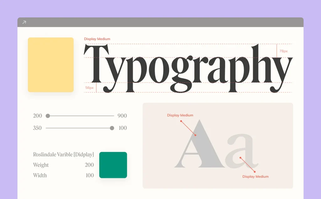
It’s easy to underestimate the power of typography, but the truth is that it can deeply influence how people perceive the brand’s personality. If the font choice is off, the logo can come across as amateurish, confusing, or even untrustworthy. That’s why you should carefully consider the brand’s identity and choose a font that not only looks good but also fits with its voice, tone, and values.
When the font and the brand are in sync, the logo becomes a powerful tool for communication, recognition, and brand loyalty. So, it’s worth putting some thought and effort into typography when designing a logo.
Too Many Colors

The use of a wide color palette can be overwhelming and confusing. That’s also expensive to reproduce in print and stuff like that. Designers should aim for a maximum of three colors in a logo design to make it memorable and easier to reproduce.
Additionally, a limited color palette can enhance the logo’s scalability and adaptability as well as ensure the logotype looks great and maintains its impact across different applications.
Other Designs Copying

One of the most common pitfalls is the temptation to imitate or borrow elements from existing logos. While it may seem like a quick fix or a safe bet, copying other designs can backfire in several ways. It put the brand at risk of legal issues and undermines its credibility and originality, as customers are likely to notice the similarities and perceive it as unoriginal or lazy.
To avoid that, you need to explore different ideas and inspirations but craft a unique and compelling logo that hasn’t referenced existing companies or brands.
Ignoring Scalability

Designing a logo that looks good on a computer screen but fails to translate well on other media can be a costly mistake. To ensure that it remains effective and visually appealing across different marketing channels, it’s essential that the logo is scalable and doesn’t lose its quality when resized.
You should always be mindful of the logo’s reproduction in various formats and sizes, such as in print, on merchandise, or digital platforms. Therefore, test the logo’s scalability to guarantee that it looks great and maintains its impact across all mediums to avoid such logo design mistakes.
Focusing Just on Trends

Trends come and go, but logos are designed to last. It is important to avoid making too trendy logotypes, as they may quickly become outdated. Instead, you should aim for a classic logo design that will stand the test of time.
By focusing on simplicity, versatility, and functionality, you may create a logo that communicates the brand’s identity and values effectively and remains relevant and memorable for years to come.
Conclusion
In conclusion, creating a successful logotype requires a combination of creativity, strategic thinking, and attention to detail. That’s crucial to understand the logo design mistakes and take steps to avoid them. By following these guidelines, you can make a logo that resonates with customers and helps to build a strong and recognizable brand identity.
Further, you can always entrust this matter to specialists to save yourself the time and nerves. Logotype designers will cope with this much more effectively and transfer all the wishes into the form of a logo.
Our team designs logos for brands that value a professional approach and high-quality visualization of their desires. So, don’t hesitate to visit our website and make sure that logotype you wanted is near.
Psss, more exciting topics are coming soon on this platform. Stay tuned!