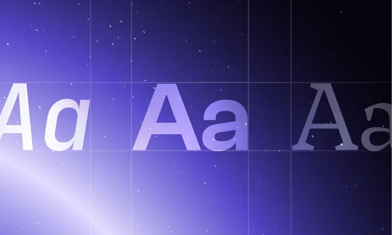

Typography is a critical design element, playing a significant role in conveying content, setting the mood, and establishing the visual identity of a project. The process of choosing typography can be both exciting and challenging.
“Typefaces express a mood, an atmosphere. They give words a certain coloring” – Rick Poynor
In this practical topic, we’ll delve into each aspect of choosing typography for your designs, equipping you with actionable tips to apply in real-world scenarios.
Understand the Purpose and Audience
Consider the context in which the design will be used: whether it’s an E-commerce website, a portfolio, or a cutting-edge technology platform. Understanding the purpose will help you determine the tone, mood, and style that your typography should embody.
Practical tip: Research similar designs or projects in your target niche to gain insights into the choices that resonate with the intended audience.
Define the Design Style

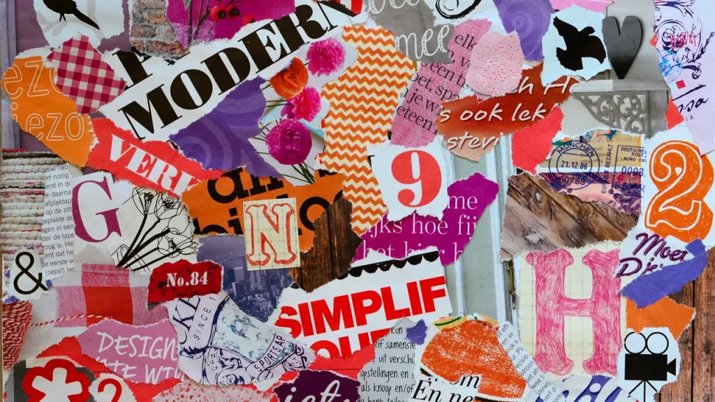
Every design has its unique style, which should guide your typographic decisions. Analyze the visual elements, such as shapes, lines, colors, and imagery. Ensure that your font complements and enhances it, creating a cohesive visual experience.
Practical tip: Create a mood board or visual collage that captures the essence of your design style. Use it as a reference when selecting typography.
Consider Readability and Legibility

Ensure that your chosen typography is easily readable by considering factors such as font size, line spacing, and letterforms. Test different variants to determine the optimal combination that ensures legibility across separate mediums and devices.
Practical tip: Conduct user testing by asking individuals from your target audience to provide feedback on the typography’s clearness.
Establish Hierarchy
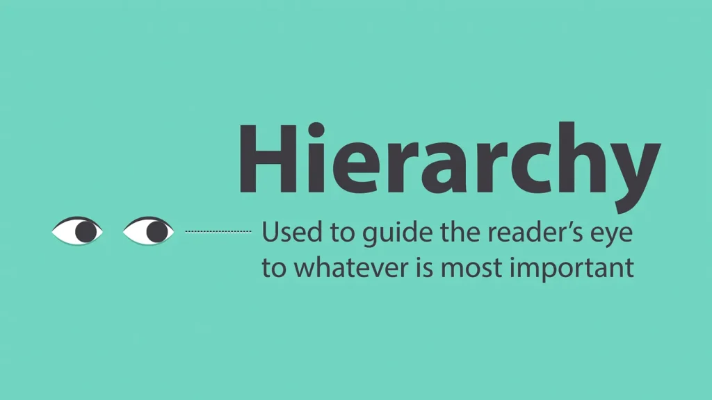
It refers to the visual organization of different elements based on their importance. By establishing a clear hierarchy, you guide the reader’s eye and create a structured flow of information. Use varying font weights, sizes, and styles to differentiate headings, subheadings, and body text.
Practical tip: Experiment with hierarchies using grayscale or low-fidelity prototypes to quickly iterate and refine your design.
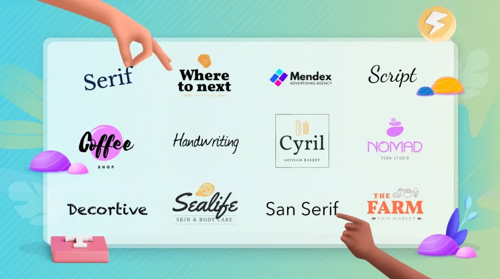
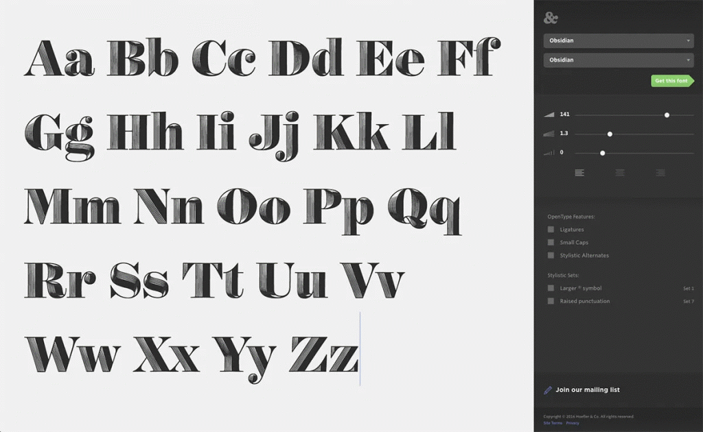
Choose Typeface Families

Typefaces are often grouped into families, offering a range of styles that can add versatility and cohesion to your designs. Opt for those that provide variations in weight, width, etc. Mixing different variants can create visual interest while maintaining consistency.
Practical tip: Use font pairing resources and tools, such as Typekit, Google Fonts, or Adobe Fonts, to explore and experiment with compatible typeface combinations.
Balance Contrast and Harmony
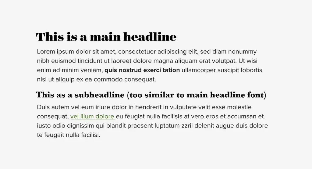
Contrast helps emphasize important elements and create visual impact, while harmony ensures that all works cohesively together. Experiment with fonts to create focal points, but be mindful of using too many conflicting styles that may result in a cluttered or chaotic design.
Practical tip: Use color contrast tools, such as Adobe Color or Contrast Checker, to ensure that your chosen typography maintains appropriate contrast levels for optimal readability.
Consider Cultural and Branding Factors
Different cultures associate certain fonts with specific emotions or meanings. Additionally, if your design represents a brand, the typography should align with its identity and values. Select fonts that resonate with the target culture and accurately reflect the brand’s personality.
Practical tip: Conduct research on cultural and branding associations with fonts and seek feedback to ensure the typography aligns with the desired cultural and branding factors.
Test and Iterate
That’s essential to ensure its effectiveness in different contexts. Consider how it appears on various platforms, devices, and screen sizes. Test the readability and visual impact of your typography by gathering feedback from peers, clients, or even potential users. Be open to making adjustments and iterating on your design to refine the typography and achieve the desired results.
Practical tip: Create prototypes or mockups of your design and gather feedback from a diverse group of individuals to gain multiple perspectives on the typography.
Conclusion
Choosing typography for your designs requires a thoughtful and practical approach. By understanding the purpose and audience, defining the design style, prioritizing readability/legibility, establishing hierarchy, selecting typeface families, balancing contrast & harmony, considering branding factors, and iterating, you can make informed decisions that elevate your designs.
Remember, typography is a powerful tool that can enhance communication, evoke emotions, and create a memorable visual experience. Embrace the process of selecting typography as an opportunity to express the personality of your design and connect with your audience effectively. With the knowledge and practical tips outlined in this guide, you are now equipped to confidently choose the right typography for your designs and create impactful visual compositions.
Psss, more exciting topics are coming soon on this platform. Stay tuned!